Challenge
Today there is no law in Brazil that imposes the obligation of brands to put clear nutritional information on their labels, it is provided little information containing present technical terms that are difficult to understand.
To solve this problem, the student Alessandro Rangel Carolino Sales Silva developed the RotulApp project as part of the doctorate he is carrying out in the Postgraduate Program in Food Science (PPGCA), in the scope of the research about Food Science and Nutrition Group (PeCAN), where it is studied food labeling and ways of communicating nutritional information, besides studying potential problems related to the use of basic information available on products.
The Problem
Due to the urgency of collecting research data, a developer was hired to create a prototype just to be able to collect the data necessary for the study.
However, as a previous user experience and user interface study was not carried out, many people, especially the elders, had difficulty using the app.
In order to understand the problems, I did a usability test with 20 people and they all reported difficulty in reading and understanding.
Process
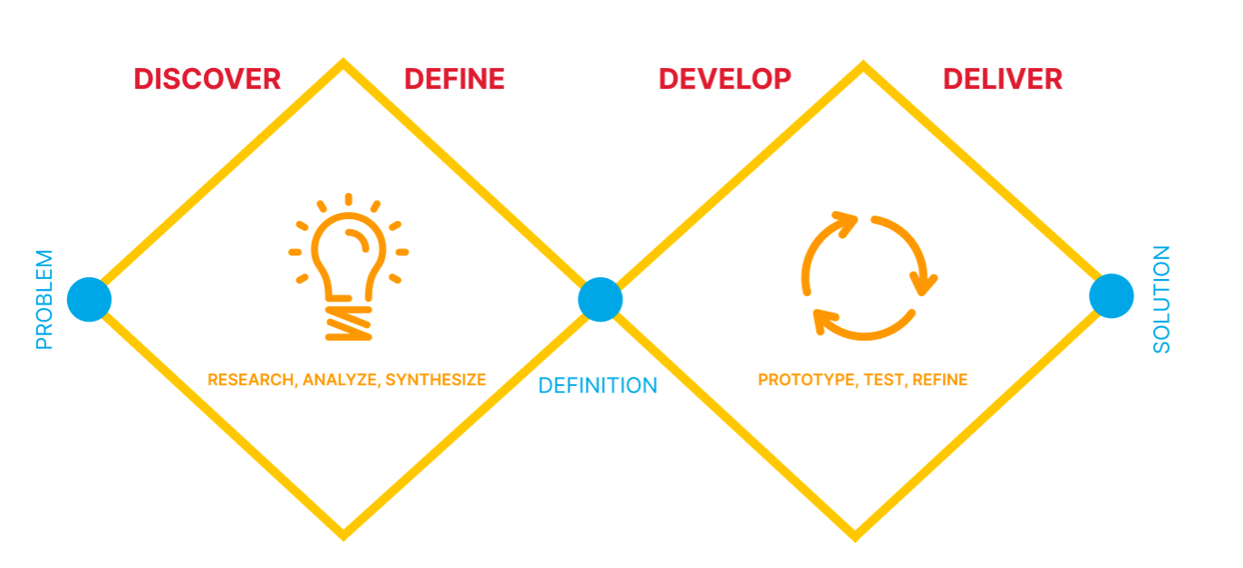
Research
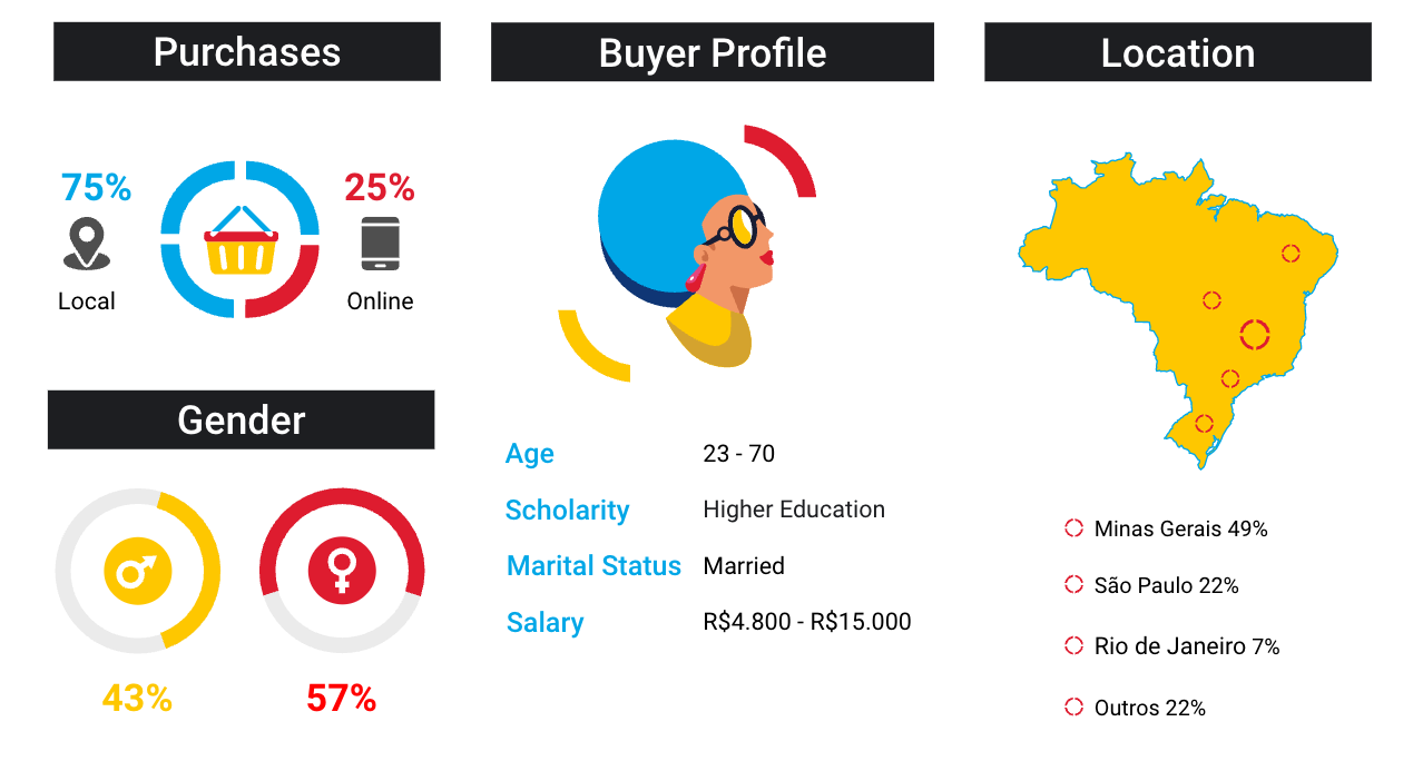
For the quantitative research, I collected information from 3,004 people.
I collected information on gender, age, education, income, marital status, whether the person is responsible for home purchases, and in which region of the country they reside.
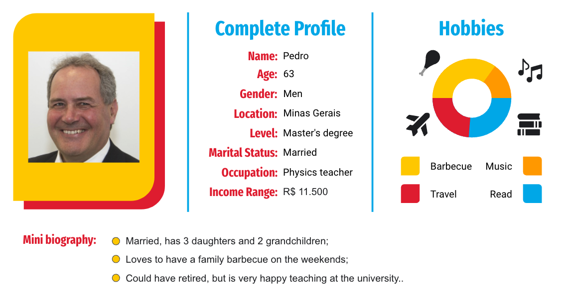
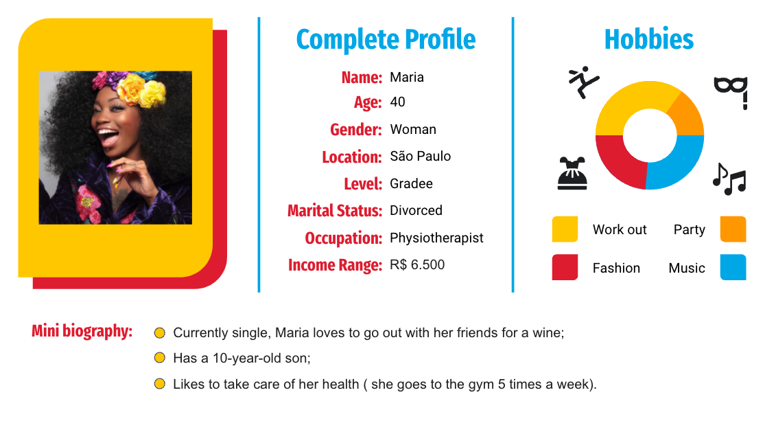
Personas
After analyzing all the data collected, I created two Personas profiles.
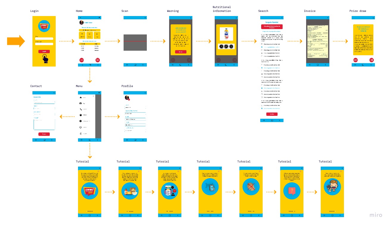
User Flow
After numerous testing and feedback, I altered the app's user flow.
To show the connections between the app's features, I created a user flow that would help the users easily navigate through the app, as well as adjust to the functionality of the app.
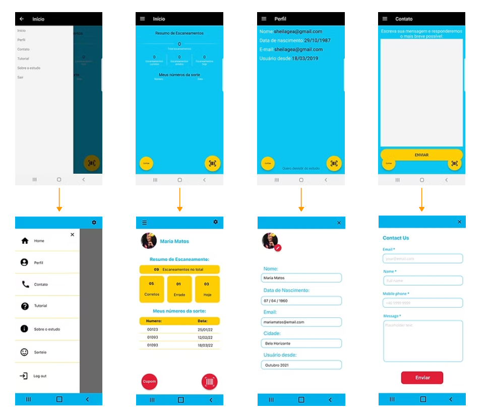
Mockups
To improve understanding and facilitate user choices, a new design was created.
The main improvements were:
- Used icons to help make navigation easier.
- I changed the font, font size and background colors to better understand the texts.
- A simpler user flow has been created, which takes them from the entry point through a set of steps to a successful outcome.
- Creating a simple and fun tutorial for better understanding and answering questions.
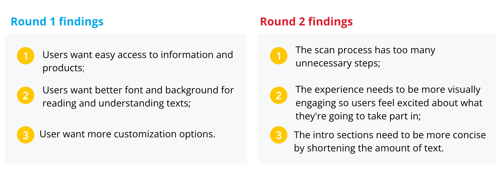
Usability Test
I conducted two rounds of usability studies. Findings from the first study helped guide the designs from wireframes to mockups. In the second study, it was used a high-fidelity prototype and revealed what aspects of the mockups needed refining.
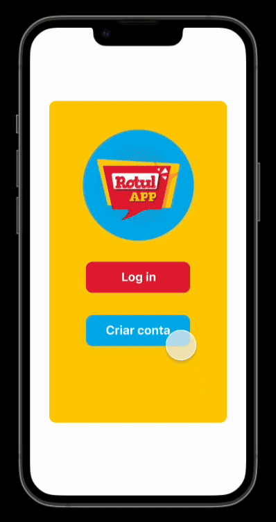
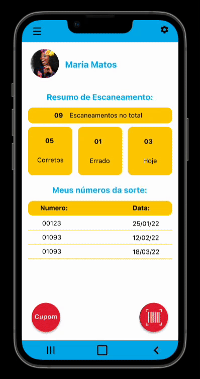
The Prototype
To improve understanding and facilitate user choices, a new design was created.
I have combined all the elements shown throughout the design process to create what I feel is a warm, functional, fun and approachable app.
A/B Testing
With the redesigned prototype ready, I wanted to validate specific design decisions before finalising the interface, particularly around the elements that had caused the most friction in usability testing: readability, nutrient visualisation, and onboarding.
I ran two rounds of A/B tests with a total of 598 participants, recruited across age groups to ensure the results reflected the app's diverse user base, including older adults who had struggled most with the original prototype.
What I Tested
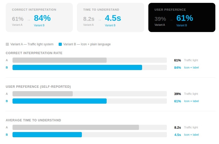
Test 1: Nutrient Alert Display
The core feature of RotulApp is flagging excess nutrients. I tested two ways of communicating this:
- Variant A: Traffic light colour system (red / yellow / green) with a numeric value.
- Variant B: Icon-based indicator (warning symbol) with a plain-language label (e.g. "High in sugar").
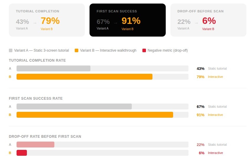
Test 2: Onboarding Format
Given that many users (especially elders) needed extra guidance, I tested two tutorial approaches:
- Variant A: A static, skippable 3-screen tutorial shown at first launch.
- Variant B: A short interactive walkthrough embedded in the first real scan flow.
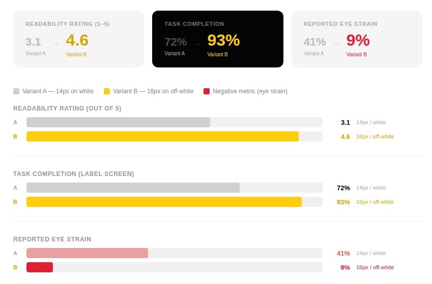
Test 3: Font Size & Contrast
I tested two versions of the label detail screen:
- Variant A: 14px body text, white background.
- Variant B: 16px body text, warm off-white (#FAF7F2) background.
Results
Test 1: Nutrient Alert Display
Variant B won clearly. Users (particularly those aged 50+) responded significantly better to the plain-language label. Several participants noted they hadn't realised what the colours meant without an explanation, while the icon + label format was immediately understood.
Test 2: Onboarding Format
The interactive walkthrough produced a dramatic improvement in both completion and first-use success. The static tutorial was frequently skipped, leaving users without the context they needed to use the app confidently. Embedding guidance into the actual scan experience made it feel less like an obstacle.
Test 3: Font Size & Contrast
Variant B was the decisive winner. The combination of a slightly larger font and a warmer background colour reduced glare and significantly improved readability, especially under the artificial lighting conditions typical of a supermarket environment, which several participants mentioned during testing.
What Changed
The A/B testing results directly shaped the final design decisions:
- The icon + plain-language label system replaced the traffic light approach across all nutrient alert states
- The interactive walkthrough became the standard onboarding experience, with the static tutorial removed entirely
- 16px body text and the off-white background were applied across all information-heavy screens in the app
These changes, layered on top of the usability study findings, gave me confidence that the final prototype wasn't just visually improved; It was measurably easier to use for the people who needed it most.
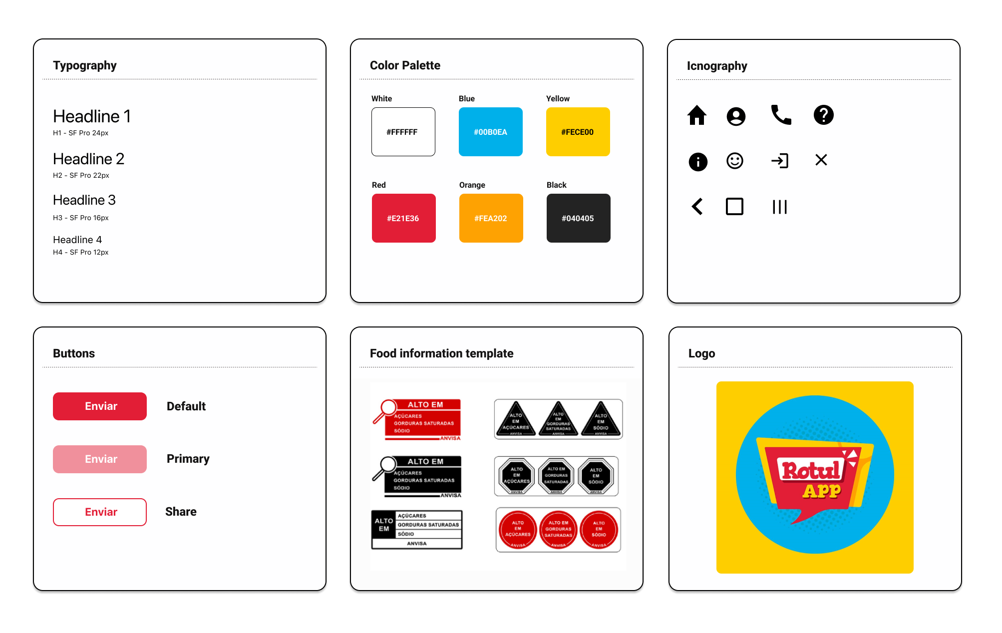
Style Guide
I developed a design system to add consistency, structure and communication across all team members. I chose a simple readable humanist typeface that would improve reading legibility in both small and large sizes. The colour palette is mature, yet modern and has good contrast.
I also implemented icons and friendly illustrations to bring some fun and enjoyment to the app.
The Solution
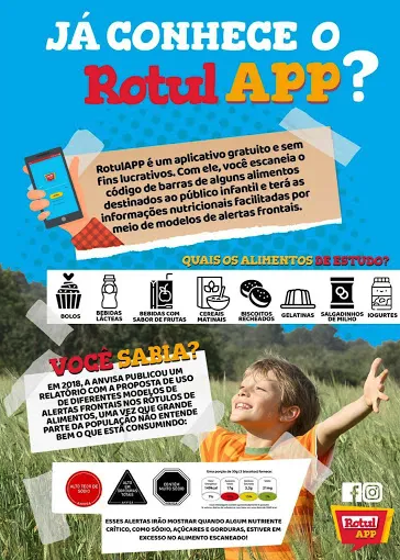
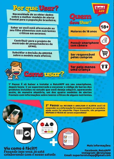
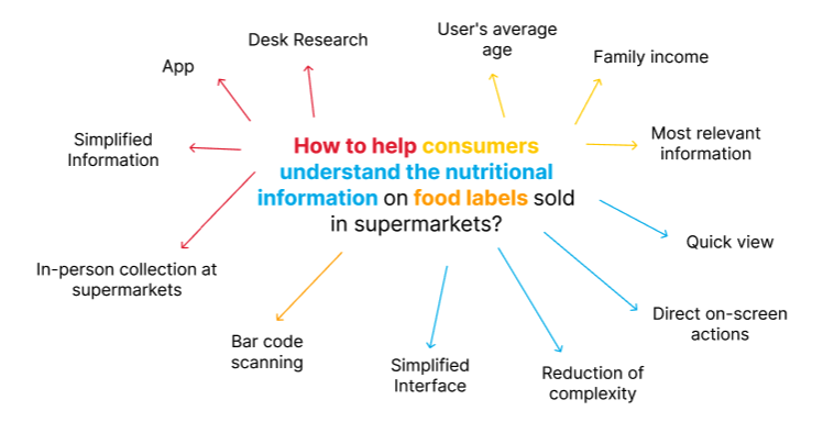
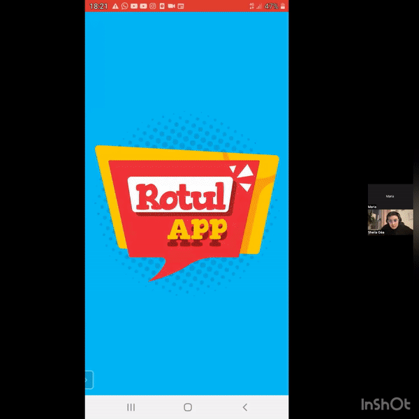
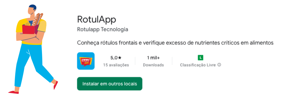
The RotulApp application was created to help consumers understand the nutritional information on food labels sold in supermarkets.
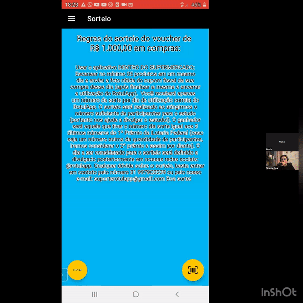
Through product barcodes, RotulApp checks for the presence of excess nutrients, such as sugar, saturated fat, and sodium in processed and ultra-processed foods.
The app is free and available for Android devices (only in Brazil).
Next Steps
For the next steps:
- We will improve the product database;
- Create personalized list options, such as a list of already scanned products that are healthy and another with unhealthy products;
- Conduct more user research to determine any new areas of need;
- Conduct another round of usability studies to validate whether the pain points users experienced have been effectively addressed.
Learn More
To learn more about the App and PhD research, watch the article made by the UFMG channel: