Presentation Video
About the Game
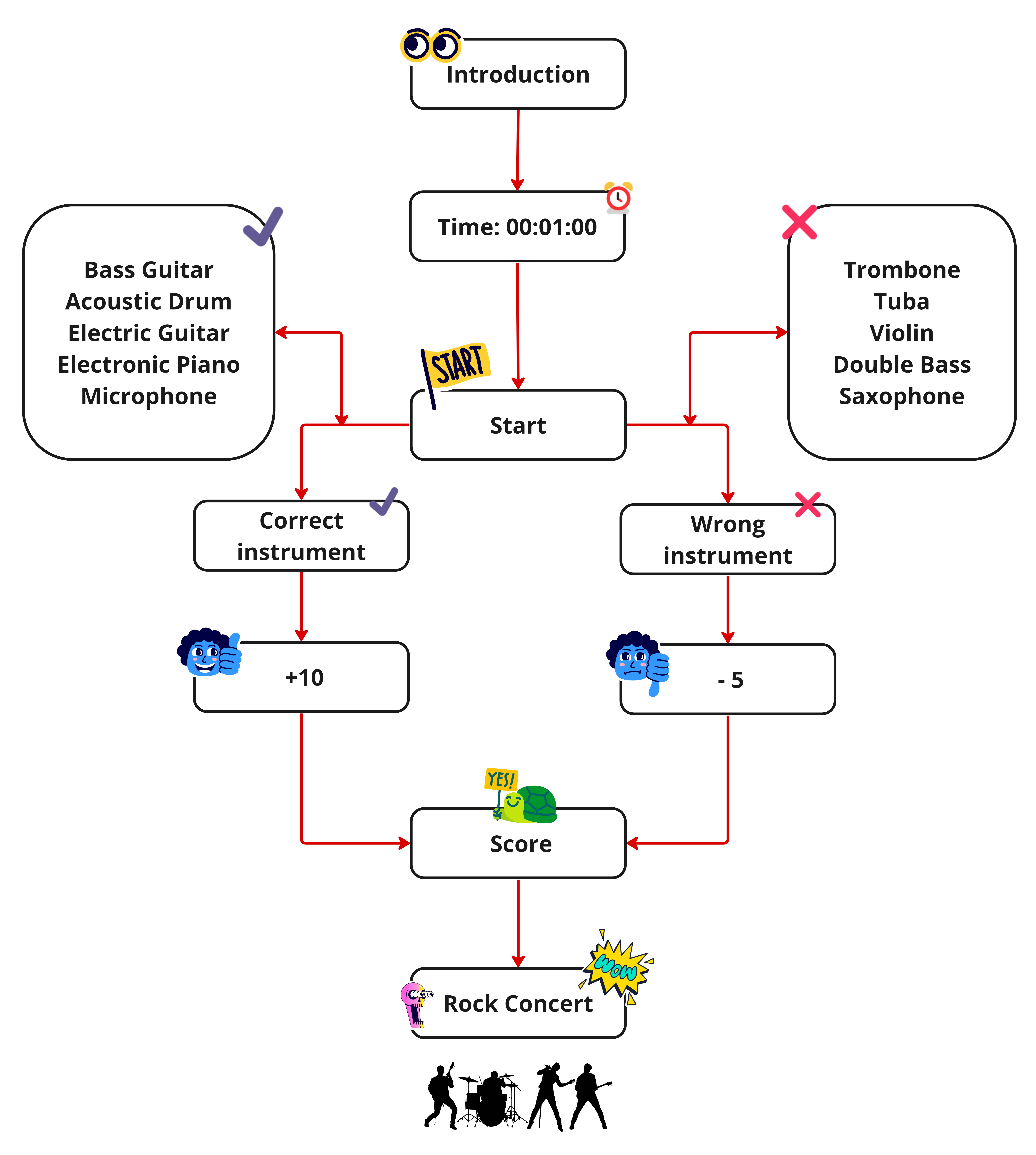
In this dynamic game, you are the Roadie of a rock band (A roadie helps musicians while they are on tour by setting up and dismantling equipment, loading the van, and perhaps driving it from gig to gig.)
The concert starts in 1 minute, so that's how long you have to collect as many of the band's instruments as possible, but be careful!
When you collect instruments that are not from the rock band, you lose points!
Score:
- Rock band instruments: +10 points
- Classical instruments: -5 points
Good luck!
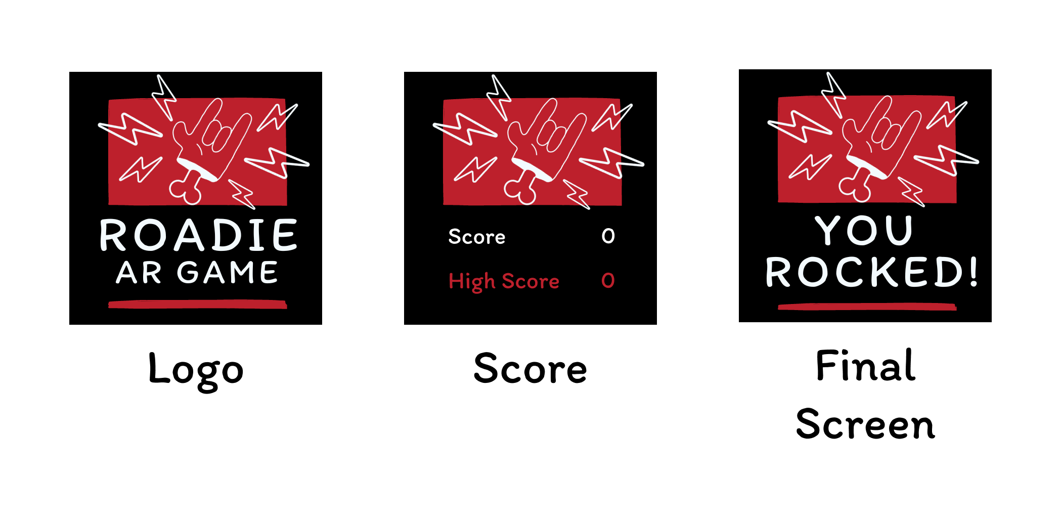
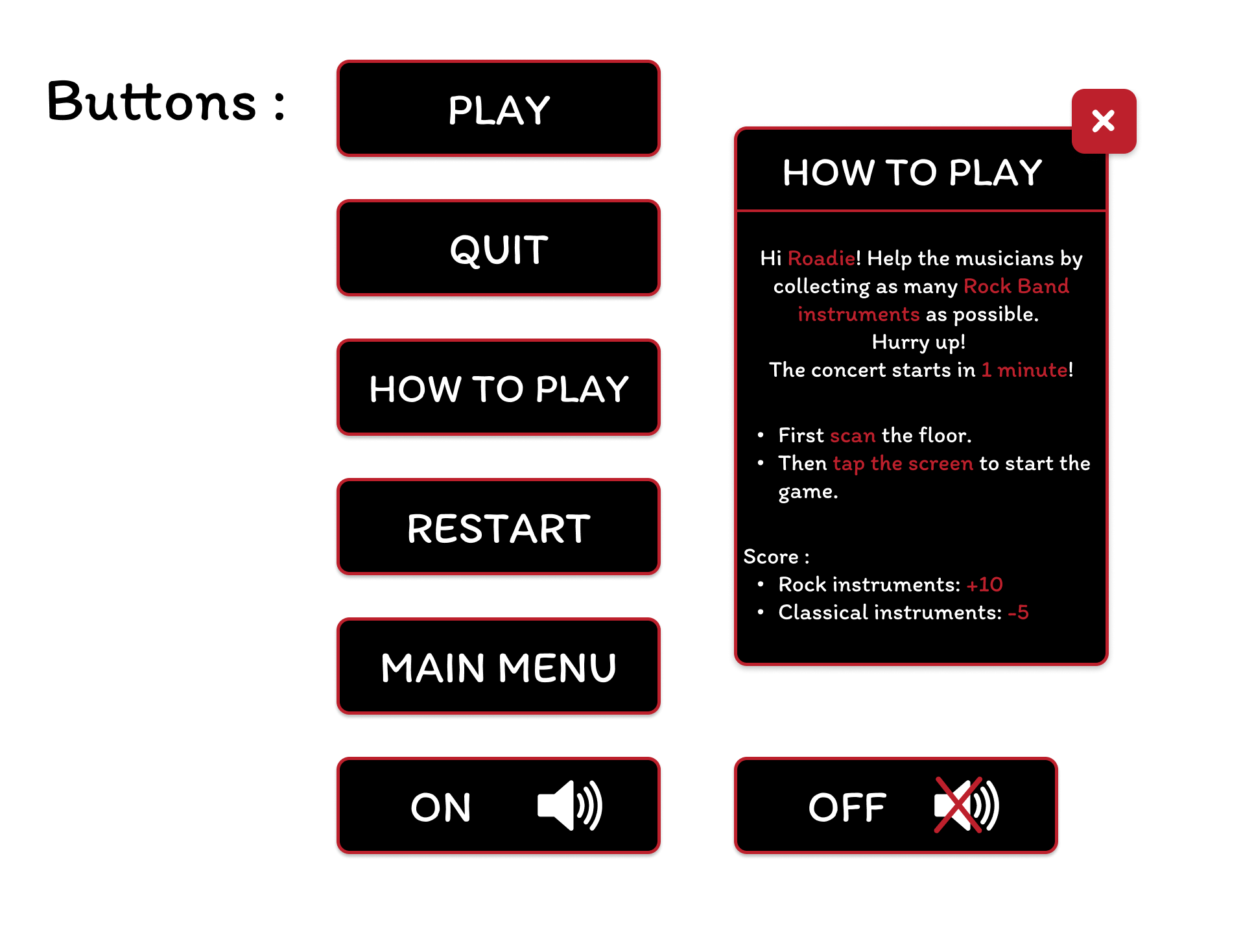
Game Screens
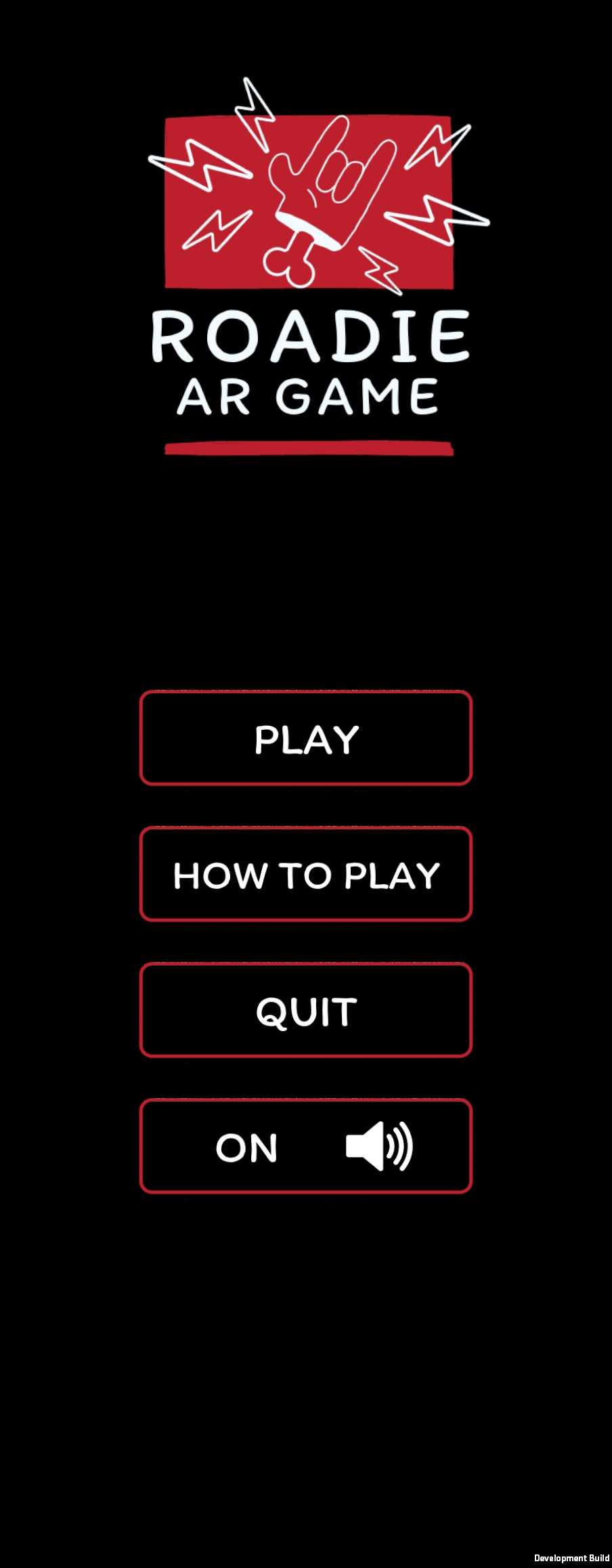
Main menu
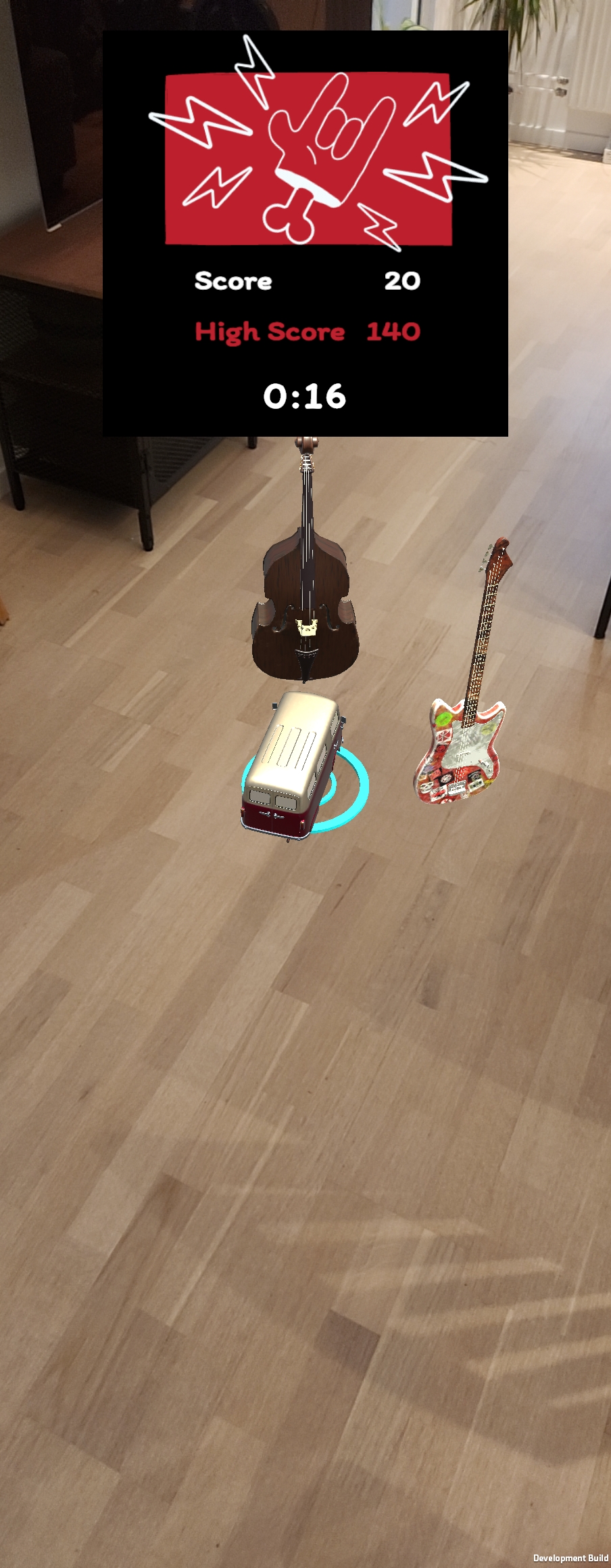
Game
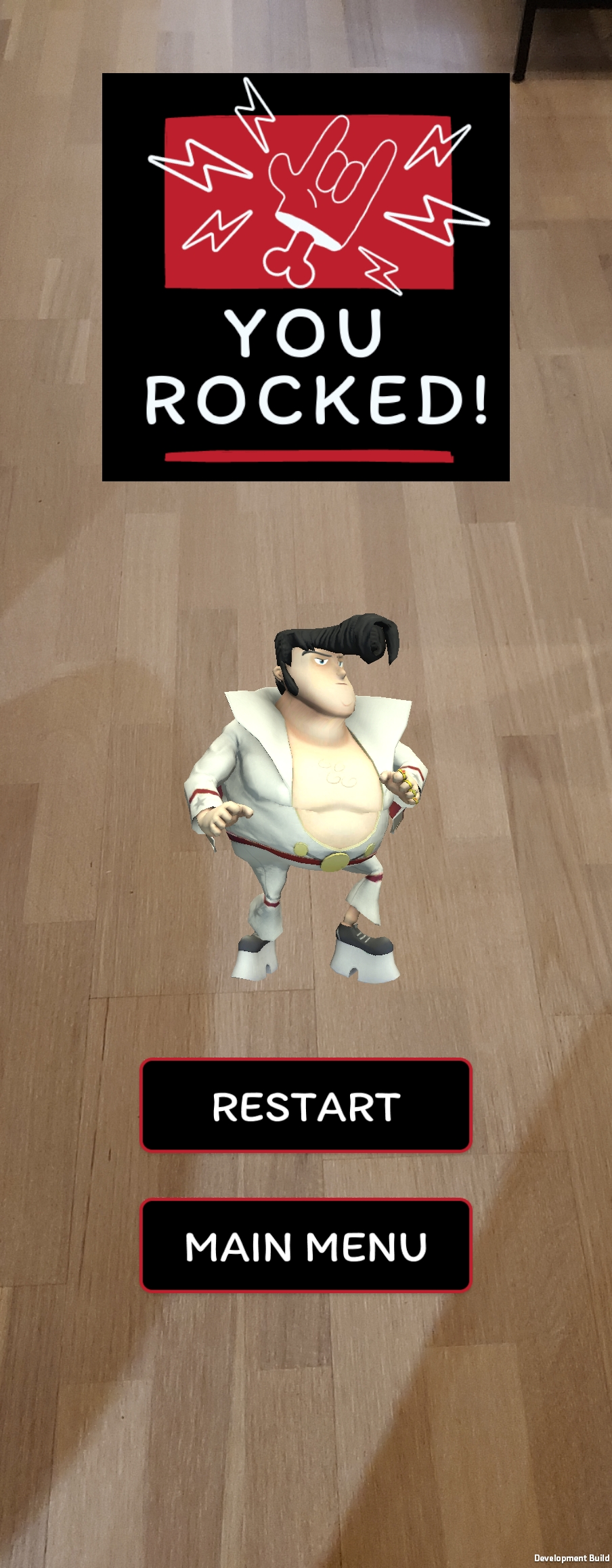
End menu
Flowchart
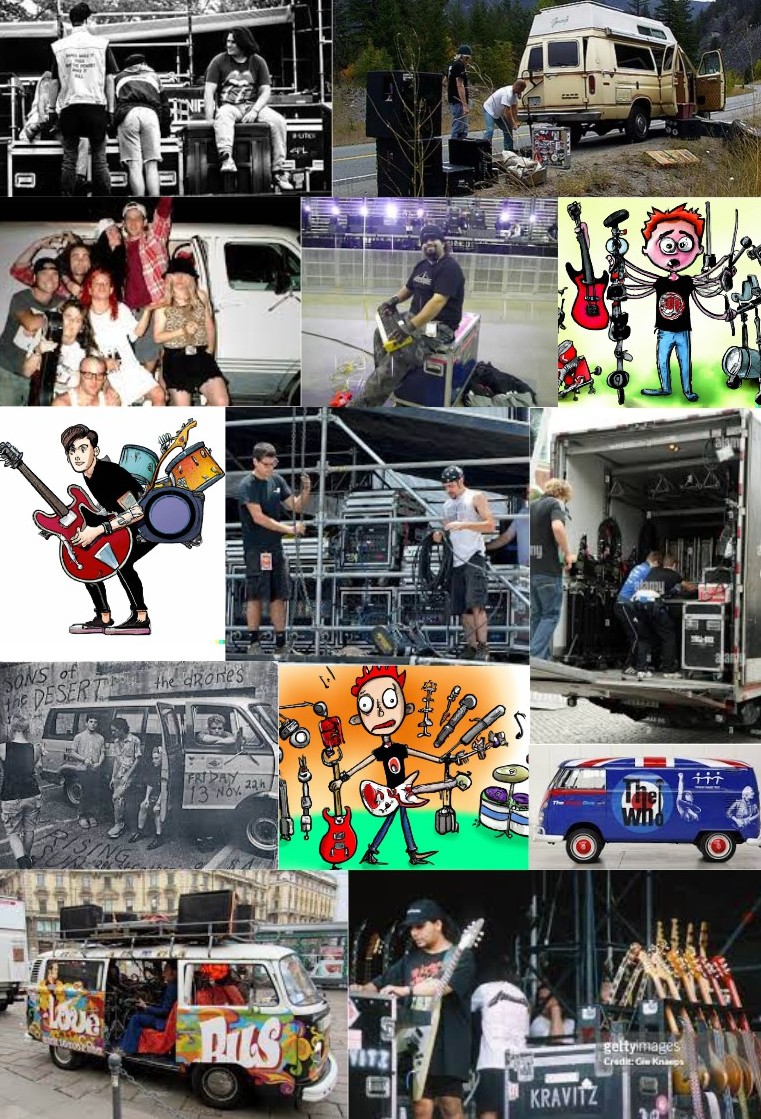
Moodboard
UI Design
In Roadie AR Game, the user interface (UI) is crucial for several reasons:
- Navigate Smoothly: The UI helps you seamlessly blend virtual elements into the real world, making your gaming experience smooth.
- Info Hub: Keep tabs on scores, mission details, and game status. The UI ensures you're always in the loop.
- Quick Feedback: Get instant feedback on your moves, helping you understand the game dynamics better.
- Easy Controls: Effortlessly use the camera without any hassle, making your gaming journey frustration-free.
- Immersive Vibes: The UI creates an immersive gaming environment by seamlessly integrating virtual and real elements.
- For Everyone: Designed to work across different devices, the UI makes sure everyone can join the fun.
- Aesthetically Pleasing: Beyond functionality, the UI adds a touch of style and complements the game's theme.
To sum it up, the well-crafted UI in Roadie AR Game is your guide, information center, quick feedback buddy, easy control facilitator, immersion creator, universal companion, and style enhancer. All working together to elevate the gaming adventure.
A/B Testing
With the core AR mechanics built and a working prototype in hand, I wanted to validate the UI decisions that carried the most risk, the ones where getting it wrong would break immersion or frustrate players before they ever understood the game.
AR games introduce a unique design challenge: the interface has to compete with the real world for attention. Every label, timer, and feedback cue needs to communicate instantly, because players are physically moving and making split-second decisions. I couldn't rely on intuition alone for that.
Using VWO's A/B testing tool, I ran three targeted tests with 72 participants across 15 days, focusing on the three moments where UI and gameplay intersect most directly: how players receive score feedback, how they identify which instruments to collect or avoid, and how they experience the pressure of the 60-second countdown.
Each test isolated a single variable (one design decision at a time), so the results were clean and actionable rather than inconclusive.
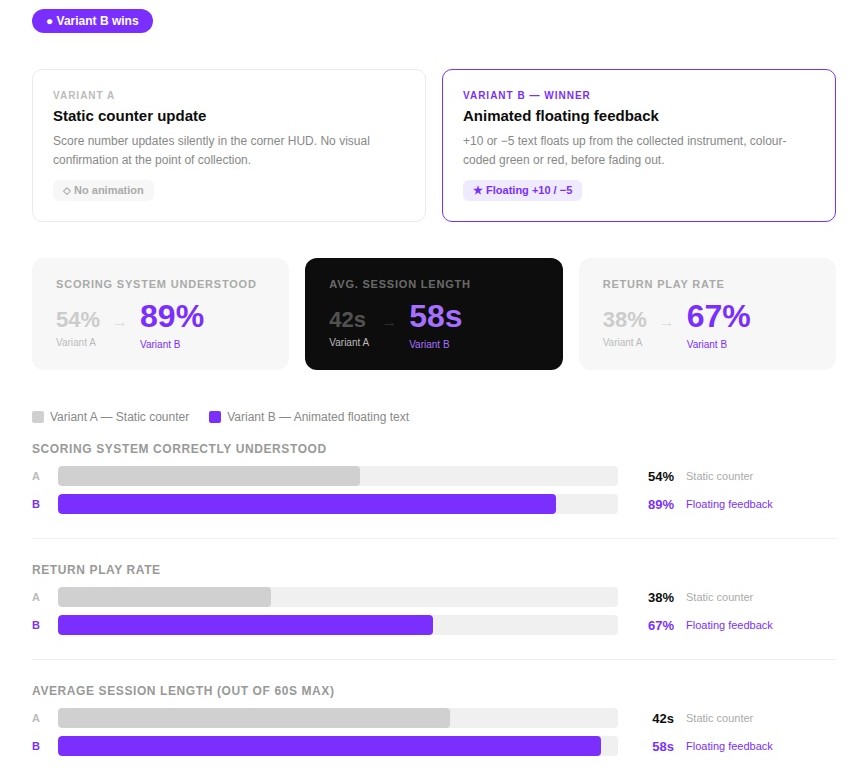
Test 01: Score Feedback
Testing: Floating +10 and −5 animation vs. a silent counter update
Winner: The floating text won hard, return play rate jumped +29pp.
Without immediate visual feedback, many players didn't realise they were losing points for picking up classical instruments until the end of the round. The animated floating text made the +10 / -5 logic instantly legible at the point of action. Return play rate rose by +29 percentage points, suggesting the feedback loop made the game feel more rewarding.
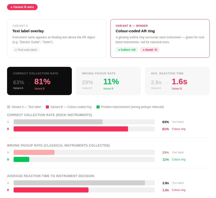
Test 02: Instrument Detection
Testing: Text labels vs. colour-coded AR rings for collect/avoid decisions
Winner: The ring system cut wrong pickups by 18pp and halved reaction time, makes sense for a fast AR environment where reading slows you down.
Reading text labels mid-game broke concentration and added cognitive load. The colour-coded AR ring allowed players to make collect/avoid decisions at a glance - cutting reaction time by 1.2 seconds and reducing wrong pickups by 18 percentage points.
The green/red system also mapped naturally to the game's +10 / -5 scoring logic, reinforcing both UI layers simultaneously.
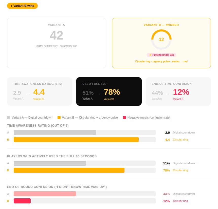
Test 03: Timer Display
Testing: Plain digital countdown vs. a shrinking circular ring with an urgency pulse under 15s
Winner: The ring made time feel physical. End-of-round confusion dropped by 32pp and 27% more players used the full 60 seconds.
With only a number in the corner, nearly half of the players were caught off guard when the round ended. The circular ring made time feel physical and draining - visually shrinking as the 60 seconds passed. The amber-to-red urgency pulse under 15 seconds significantly heightened focus and pushed players to keep collecting rather than stop early. End-of-round confusion dropped by 32 percentage points.
What Changed
The A/B testing results reshaped two core UI elements before the final build was locked:
- The static score counter in the HUD was replaced with animated floating feedback, a +10 or −5 text rising from the collected instrument and fading out. This one change made the scoring logic legible in real time, without players needing to glance at a corner of the screen mid-movement.
- Text label overlays identifying instruments were kept as the final design, a deliberate choice against the data. While the colour-coded AR rings performed better in testing, removing the need to read and recognise instruments made the game too easy. The cognitive effort of identifying a violin from a guitar mid-movement is the challenge. The label system stays because difficulty is a feature, not a flaw.
- The digital countdown number was replaced with a circular progress ring that visually shrank as time passed, turning amber and pulsing in the final 15 seconds. Players stopped being caught off guard by the round ending, and more of them pushed hard right to the last second.
Taken together, these weren't cosmetic improvements. They were the difference between a UI that sat on top of the game and one that became part of it.

Download the Game!
Installation:
- Download the APK file
- Only for Android phones
🎮 Instructions:
There is no minimum space, but the ideal is to play in a place with a free area.
Download on itch.io*You will be redirected to https://sheilagea.itch.io/.